About the Tool
Purpose: Productivity Measurement
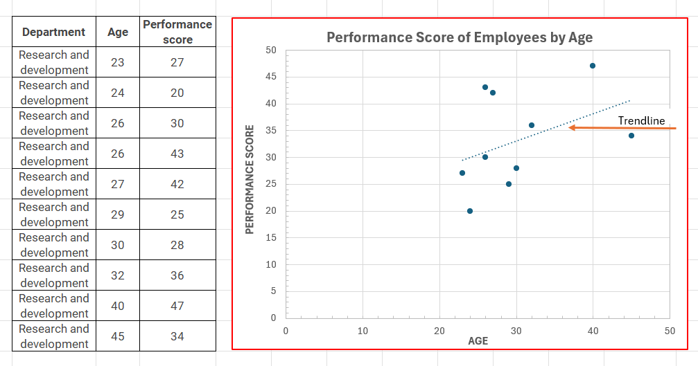
The scatter diagram, a cause analysis tool, is also known as a scatter plot, scatter graph, or
correlation chart. It provides information about the relationship between two variables and how
closely they are related. One variable, typically the independent variable, is plotted on the
horizontal axis, while the other variable (the dependent variable) is plotted on the vertical axis.
The distribution of points on the diagram shows the degree of correlation between the
variables.
Lean Six Sigma and data-driven process problem-solving heavily rely on scatter diagrams.
The patterns help with process variable and performance metric analysis by showing the
relationship between variables. They are commonly utilized due to their simple, appealing
visual layout, versatility, ability to include multiple variables, and ability to perform statistical
tests like correlation, regression, and clustering. They convey information effectively without
lengthy explanations.
How to Use the Tool
Estimated Time Needed: 2 hrs
Target Participants or Users: Process Owners, Planning Officers, Quality Control
Inspectors, Project Managers
Steps
- Gather and list of paired sets of data.
- Determine dependent and independent variables.
- Construct the horizontal (x) and vertical (y) axes.
- Plot the data by placing a mark at the point corresponding to each x-y pair.
- Assign independent variables to the horizontal or x-axis.
- Assign dependent variables to the vertical or y-axis.
- Label the x and y axes.
- Write the diagram title.
1. Marson, B. (Ed.) (2020). APO Manual: Public-sector Productivity. Asian Productivity Organization. https://doi.org/10.61145/LGOT4261
2. Cancian, M. (2021). What is a scatter plot? How to make one! Think Lean Six Sigma. https://www.thinkleansixsigma.com/article/scatter-diagram