About the Tool
Purpose: Productivity Measurement
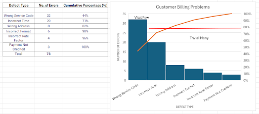
A Pareto Diagram is a graphic tool that shows the primary factors contributing to problems. Originating from the Pareto Principle, or the 80/20 rule, established by economist and engineer Vilfredo Pareto, it suggests that 80% of the results are derived from 20% of causes. The diagram has two types of data composed of a curved line that represents the data’s cumulative total and bars that show individual values arranged in descending order. There is also an 80% cut-off line to show where the 80/20 rule applies. The few important issues that demand the greatest attention fall under the 80% cut-off line.
Pareto diagrams are a useful tool for root cause and problem analysis in a variety of contexts, including business revenues, traffic, transportation, and manufacturing processes. They break down problems into components and communicate the significant causes of issues that may be impacting efficiency and outputs within departments or sectors. Manufacturers also use it to analyze quality and defect because they show the frequency and severity of certain problems. It helps managers prioritize solving the most important problems first.
How to Use the Tool
A. Organizing the data
1. Identify and list the problems or issues.
2. Organize the problems or issues into groups or categories.
3. Create three columns for categories of problems, their corresponding frequency, and cumulative percentage.
- To calculate the cumulative percentage, divide the cumulative frequency by the total number of observations. Then multiply the result by 100.
Cumulative percentage = (Cumulative frequency ÷ n) x 100 - To calculate the current cumulative frequency, add all other preceding frequencies together
Cumulative frequency = f1 + f2 +…
4. Organize data based on the frequency in descending order.
B. Creating the Pareto diagram
1. Construct a chart with the left vertical (y) axis scaled from 0 to at least the grand total
2. Put the appropriate label on the y-axis.
3. Scale the right vertical axis from 0 to 100 percent, with the 100 percent on the right side with the same height as the grand total on the left side.
4. Label the horizontal axis (x) with the category names in descending order.
5. Draw bars representing the amount of each category. The height of the bars is determined by the left vertical (y) axis.
6. Draw a line that shows the cumulative percentage based on the Pareto data table. The cumulative percentage line is determined by the right vertical (y) axis.
References:
- Marson, B. (Ed.) (2020). APO Manual: Public-sector Productivity. Asian Productivity Organization. https://doi.org/10.61145/LGOT4261
- Pyzdek, T. & Keller, P. (2013). The Handbook for Quality Management. (3rd Edition). McGraw-Hill, USA.