About the Tool
Purpose: Productivity Measurement
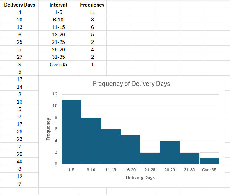
A histogram is a type of graphical data representation where the frequency of various values within a dataset is shown using rectangular bars. Though it primarily concentrates on displaying the distribution and frequency of data points, it resembles a bar graph. The height of each bar shows the frequency with which a given value or event occurs in the dataset. It makes it easier to understand and analyze the distribution and the general pattern of data, and identify areas that need improvement.
The histogram serves as a versatile graphical tool for overall efficiency and quality. Among the many applications for histograms are done in quality planning, where they help identify concerns and root causes of problems, enabling better decision-making. In quality control, they help identify issues and implement corrective steps. In project management, they help identify difficulties and repeating trends and thus prioritize measures to enhance quality, particularly for agile techniques.
How to Use the Tool
Estimated Time Needed: 30 minutes
Target Participants or Users: Process Owners, Planning Officers, Quality Control Assessors/Evaluators, Project Managers
Steps
- Gather all the needed data.
- In the first column, categorize the gathered data and list the datasets in ascending order.
- In the second column, create intervals of equal length.
- In the third column, include the frequency of data points under each interval.
- Based on the given data, draw and label the horizontal (x) and vertical (y) axes.
- Draw bars according to the frequency and interval of the given data. Bars must not have spaces between them.
- Provide a title for the histogram chart.
Sample Histogram