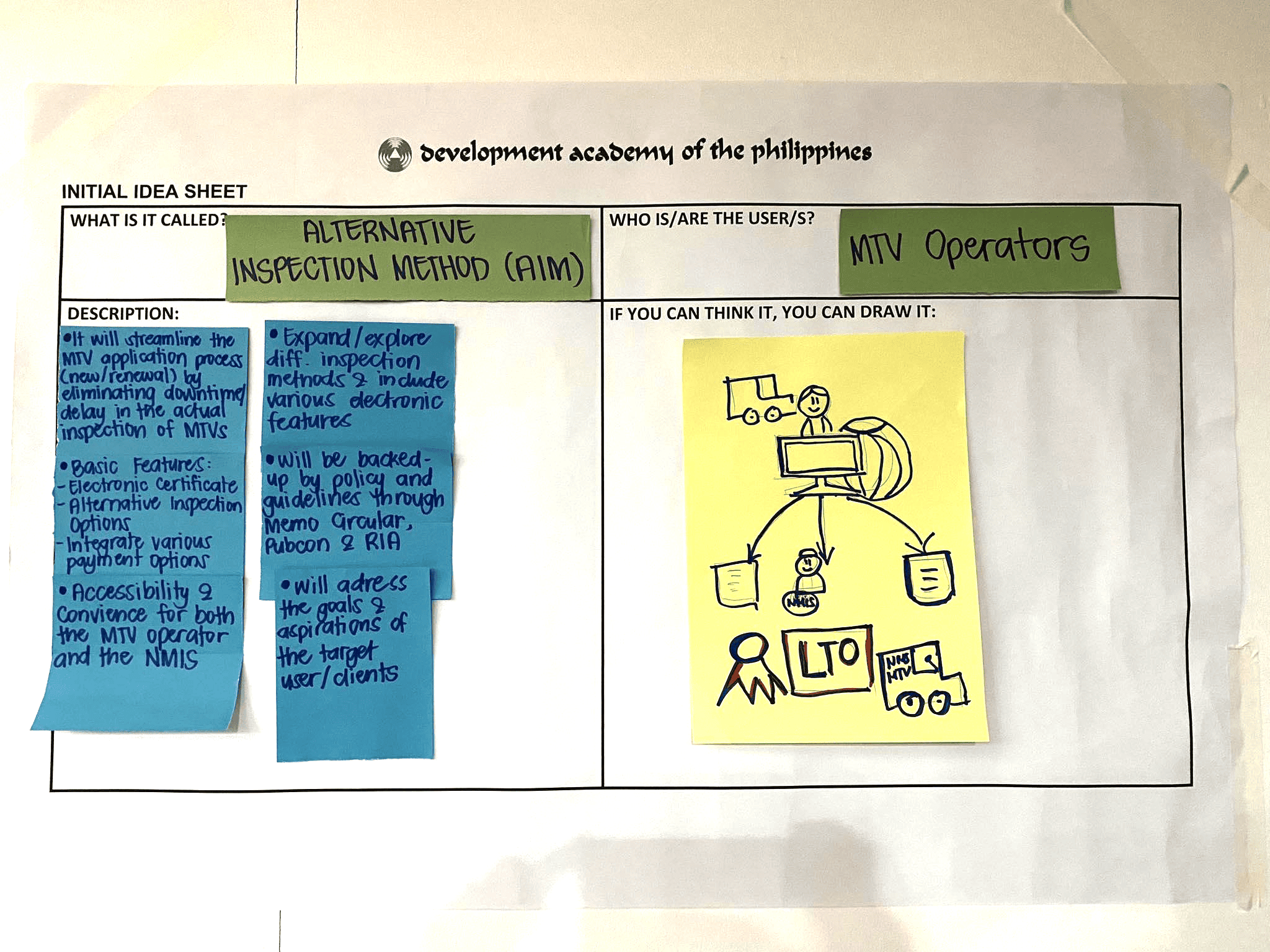
About the Tool

An idea sheet is an idea proposal consultation template used to organize ideas when designing a citizen-centered public service. It helps teams to document the results of ideation processes and transform them into actionable solutions. The key components include a problem statement, objectives, target audience, key features, implementation plan, and evaluation metrics. Public service designers can use an idea sheet to ensure that their solutions are well-thought-out, feasible, and aligned with the needs and expectations of the citizens they serve.

Purpose: Synthesizing of ideas

Estimated Time Needed: 30 minutes

Target Participants or Users: Change Managers, Community Engagement Teams, Operations Managers, Public Service Providers, Process Planners, Policymakers, Service Designers

How to Use the Tool

Steps:

  1. Select your innovation project.
  2. Select a stakeholder/s for your solution.
  3. Fill out the description using the following guide questions:
  • a. What are the objectives of the idea?
  • b. What are the immediate gains and long-term results for your target beneficiaries?
  • c. What are the basic features of the idea?
  • d. What is the most important thing to look for?
  • e. How different is it from the existing one?
  • f. How will this idea be executed?
  • g. How does this idea align with the needs or requirements of your target users?

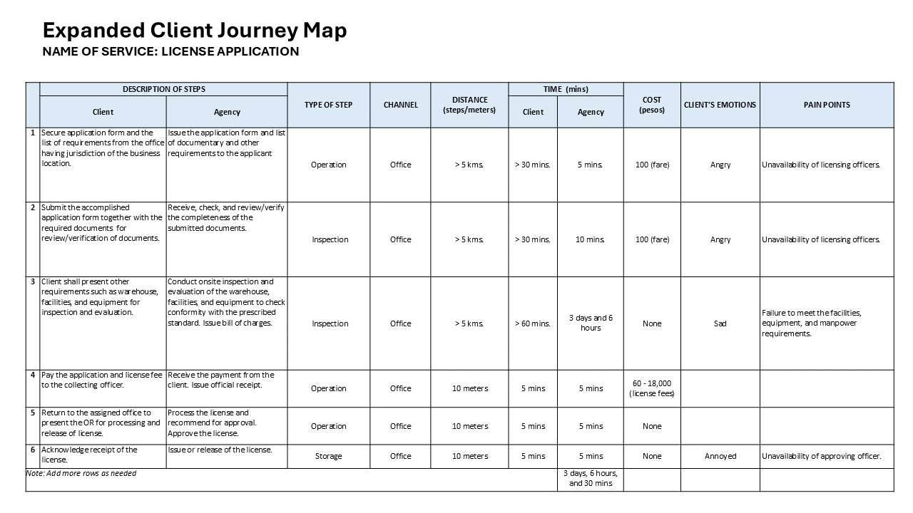
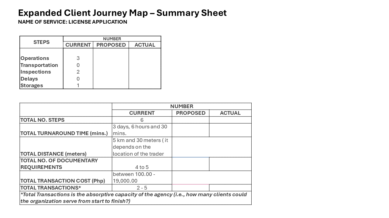
Sample Idea Sheet Template

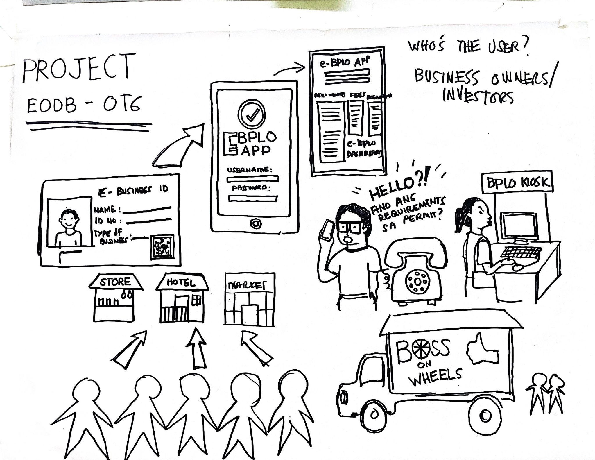
Sample Idea Sheet Activity Output

About the Tool

An affinity diagram organizes and categorizes large volumes of data, ideas, or insights by grouping them based on natural relationships. Typically, participants write down ideas on sticky notes and then work together to sort these notes into clusters that represent common themes or concepts. This method is especially useful for organizing ideas generated during brainstorming or ideation sessions, helping to identify patterns and structure in complex information.

Purpose: Synthesizing of ideas

Estimated Time Needed: 15 minutes

Target Participants or Users: Change Managers, Program Managers, Operations Managers, Planning Officers, Process Planners, Service Designers

How to Use the Tool

Steps:

  1. After brainstorming and ideation sessions, each team should group similar ideas. As each person adds notes on the board, one team member will group ideas into themes. Make sure the board also has a “Miscellaneous” section for notes that do not seem to fit with other themes. Use lines to connect related groups and combine clusters to create super groups if necessary.
  2. Ask each group to place a creative title on top of each category to summarize its contents.
  3. Team members are also encouraged to build on each new idea added to the board.
  4. Share and discuss clustered ideas as a group.

Sample Affinity Diagram Template

Sample Affinity Diagram Activity Output

Dam, R. F. and Teo, Y. S. (2022, May 2). Affinity Diagrams: How to Cluster Your Ideas and Reveal Insights. Interaction Design Foundation – IxDF. https://www.interaction-design.org/literature/article/affinity-diagrams-learn-how-to-cluster-and-bundle-ideas-and-facts

About the Tool

A design charrette is a short, collaborative meeting during which team members quickly collaborate and sketch designs to explore and share diverse ideas.

The goals and benefits of design charrettes include drawing inspiration from diverse ideas, providing a creative jump-start for designers, gaining insight into priorities across various functional groups (while building consensus), and ensuring that all participants feel equally heard and valued.

Purpose: Ideation

Estimated Time Needed: 30 minutes

Target Participants or Users: Change Managers, Program Managers, Operations Managers, Planning Officers, Process Planners, Policymakers, Service Designers

How to Use the Tool

Steps:

  1. Using a pen and paper, each team member sketches their own ideas for 15 minutes, answering the challenge statement “How might we?” This is supposed to be fast. People may sketch one or several ideas until they run out of paper, ink, or inspiration.
  2. Each team member will be given 3 minutes to share their idea, which will be critiqued by team members.
  3. After the 1st round, the team members will work in pairs for 15 minutes to synthesize the good concepts and come up with the next better design concept.
  4. The pair will be given 3 minutes to share their idea, which will be critiqued by team members.
  5. Together, as a group, critique these new designs and make final decisions about the solutions you’d like to carry into prototypes.

Sample Activity

Sample Design Charrettes

  1. DOEE (2018). Integrated Design Charrette Toolkit. https://doee.dc.gov/sites/default/files/dc/sites/ddoe/service_content/attachments/DC-NZECharetteToolkit.pdf
  2. Project Re-Envision (2019). Design Charrette Report. https://pre.dcp.ufl.edu/wp-content/uploads/2021/04/04122020-HUD-Re-envision_8x11.pdf

About the Tool

SCAMPER is a creative thinking and problem-solving technique to enhance ideas, products, processes, or services. It looks at different aspects of a problem using the seven thinking approaches:

  • Substitute: What elements can be replaced or substituted to improve the idea or product?
  • Combine: How can you combine this idea with other materials or resources to produce something new?
  • Adapt: How could you adapt or adjust your organization’s input, process, or output (product or service) to serve another purpose or use?
  • Modify (or Magnify, Minimize): What could you add to modify your organization’s input, process, or output (product or service)?
  • Purpose: How can you use this idea differently or for another purpose?
  • Eliminate: What elements can be removed to simplify or streamline the idea?
  • Reverse (or Rearrange): What can you reverse or rearrange to generate a new perspective?

SCAMPER is often used in brainstorming sessions to stimulate creative thinking and explore alternative solutions. It is a versatile tool that analyzes all possible angles and encourages thinking outside the box.

Purpose: Ideation

Estimated Time Needed: 30 minutes

Target Participants or Users: Change Managers, Program Managers, Operations Managers, Planning Officers, Process Planners, Policymakers, Service Designers

How to Use the Tool

Steps:

  1. Let the participants select an existing input, process, or output (product or service) that they want to improve, one that they are currently having problems with, or one that they think could be a good starting point for future development.
  2. Ask questions about the input, process, or output (product or service) they have identified, using the mnemonic SCAMPER to guide them. Brainstorm as many questions and answers as they can.

Sample SCAMPER Template


Sample SCAMPER Activity

About the Tool

Opposite thinking is a tool that helps teams arrive at creative ideas by looking at a problem or situation from a new perspective. This tool is a great brainstorming technique for thinking outside the box. It can stimulate creativity, enhance problem-solving, and provide a fresh perspective on challenges.

Opposite thinking is helpful when launching a new initiative or attempting to resolve a complex problem. By examining situations from a different angle, the tool helps identify hidden assumptions or aspects that may have been overlooked. Opposite thinking also enhances learning from experiences by extracting valuable lessons that can guide future approaches to similar situations. Anyone looking to improve their problem-solving abilities or creative thinking can benefit from using opposite thinking tools. This way of thinking encourages stepping out of comfort zones to explore unconventional solutions and make more well-rounded decisions.

Purpose: Ideation

Estimated Time Needed: 30 minutes

Target Participants or Users: Change Managers, Program Managers, Operations Managers, Planning Officers, Policymakers, Service Designers

How to Use the Tool

Steps:

  1. Identify the problem or challenge.
  2. Write assumptions related to the challenge you are trying to solve. These assumptions could be about current customers’ beliefs, behaviors, needs, preferences, technology limitations, and the context in which they interact with a product or service.
  3. For each assumption, write an opposite statement. These opposite statements can be a minor change, a removal of a specific element, an exaggeration of elements or the whole situation, or the total opposite of the situation. Think about the opposite statements you have written and how they affect the problem or challenge.
  4. In the third column, write potential solutions for these opposite statements.
  5. Review all the proposed solutions.

Sample Opposite Thinking

A. Sample Template

B. Sample Opposite Thinking Output

References:

  1. Board of Innovation (2024). Opposite Thinking. https://www.boardofinnovation.com/tools/opposite-thinking/
  2. Interaction Design Foundation. Assumptions in UX/UI Design. https://www.interaction-design.org/literature/topics/assumptions

About the Tool

Crazy Eights is a core method in design sprints that serves as a fast sketching exercise, allowing participants to generate eight different ideas in just eight minutes. The primary purpose of Crazy Eights is to encourage participants to go beyond their initial, often less innovative, ideas and explore a wide range of potential solutions to a given challenge or problem.

The exercise focuses not on creating flawless designs but on allowing creative ideas to flourish. In team settings, Crazy Eights proves particularly valuable, as it generates various unique ideas that can be further developed in subsequent brainstorming sessions. Crazy Eights is an effective way to stimulate creativity and foster collaboration.

Purpose: Ideation

Estimated Time Needed: 8 minutes

Target Participants or Users: Change Managers, Program Managers, Planning Officers, Process Planners, Service Designers

How to Use the Tool

Steps

  1. Let every participant understand the challenge statement (“How might we..?)that needs to be solved.
  2. Have team members draw on paper. Each team member folds their piece of paper into eight sections.
  3. Designate a team member as the timer, setting an alarm for 1 minute for each round.
  4. Each member should sketch an idea in one section using icons and shapes. The sketches don’t have to be perfect or polished; they just need to convey the idea effectively. Write captions to explain.
  5. Stop drawing after 1 minute. Repeat this process until all sections are completed.
  6. Share ideas by posting completed papers on the board and having each team discuss their work.

Template Crazy Eights

Sample Crazy Eights

Design Sprints (n.d.). Crazy 8’s. https://designsprintkit.withgoogle.com/methodology/phase3-sketch/crazy-8s

About the Tool

An expanded client journey map is a visual tool for understanding and improving customer experiences, particularly in public services serving diverse client groups. Organizations can identify key touchpoints, satisfaction levels, and preferences by visualizing the customer’s journey. This information can be used to enhance service processes, improve the overall customer experience, and achieve organizational goals. Moreover, the insights gained from client journey mapping can inform strategic decision-making, leading to policies and strategies that better align with customer needs and preferences. Organizations typically synthesize information from interviews, observations, and feedback in creating a client journey map, often by asking clients to map their journeys.

Purpose: Service Design

How to Use the Tool

Estimated Time Needed: 30 minutes

Target Participants or Users: Change Managers, Service Designers

Steps

  1. Identify client actions and agency actions. Write the steps you have undertaken when engaging with the service provider (ex., office, apps, kiosk, or service desk). In the ‘Agency’s Action’ column, write the activity or response of the agency in guiding you throughout the process.
  2. Classify each step as one of the following types:
    Operation: Actions where there are changes made to the products
    Transportation: Products are transferred from one location and/or to another
    Inspection: Products are checked for quality and quantity
    Storage: Products are kept, held, and stored
    Delay: The process is temporarily stopped, or steps that do not add value to the product
  3. Identify the channel where the interaction takes place.
  4. Write the distance in terms of steps, meters, or kilometers.
  5. Write the time it takes for clients and agencies to complete a step in terms of minutes or hours. The time for clients includes waiting time.
  6. Identify the cost of completing each step. Include Primary Transaction Costs/Fees and Other Transaction Costs/Fees. These transaction costs are expenses a client incurred during the stage of interaction with the service or product.
  7. Identify the emotion the client feels at each step.
  8. Identify pain points clients may experience at each step. Pain points are problems or issues clients and prospective clients experience while undergoing the service or process.
  9. Count and write the number of steps that fall under Operation, Transportation, Inspection, Delay, and Storage. Add these to get the Total Steps of the entire process. Then, compute the total Time, Distance, and Cost.

Sample Expanded Client Journey Map


Reference:

  1. Design Sprints (n.d.). Crazy 8’s. https://designsprintkit.withgoogle.com/methodology/phase3-sketch/crazy-8s

About the Tool

Purpose:  Productivity Management

The problem tree diagram is a planning tool that helps identify the root causes of a problem. It creates a tree-shaped diagram that provides a logical hierarchy of their relationships. By breaking broad categories into more specific details, it moves concepts from generalities to specifics.

A problem tree analysis aids decision-making, identifies the root causes of defects, and facilitates idea generation and risk assessment by visualizing risk factors, probabilities, and potential impacts. This approach allows organizations to have a better understanding of the problem, offering various angles for intervention.

How to Use the Tool

Estimated Time Needed:  1 hour

Target Participants or Users: Change Managers, Project Managers, Planning Officers, Process Planners

Steps

  1. Define the problem statement.
  2. Write the problem statement in a square or circle at the top (for a vertical tree diagram) or far left (for a horizontal tree diagram).
  3. Identify immediate causes contributing to the central problem.
  4. Organize the diagram from broad to specific details.
  5. Create new tiers of statements and use arrows to indicate how each statement relates to the ideas in the previous tiers. This helps illustrate the connections between statements.
  6. Ask the “Why” questions to drill down to the next level of detail. Identify deeper causes, breaking them down into more detailed sub-branches.
  7. Continue until all the details for the outcomes are exhaustively mapped out

Sample Tree Diagram

About the Tool

Purpose: Productivity Measurement

The cause-and-effect diagram developed by Dr. Kaoru Ishikawa is a simple graphical method of showing the causes of any given problem. Sometimes referred to as an Ishikawa diagram or fishbone diagram, it resembles a fish’s skeleton with a fish head. The branches representing the fishbones extending to the left and right are the reasons behind its popular fishbone name. It is one of the most effective tools for problem-solving and quality improvement. All brainstormed causes are grouped according to rational categories and subcategories. These show the relationship of the data in each category and its subcategories. A good cause-and-effect diagram has many ‘bones.’

The cause-and-effect diagram can be used in product design, quality defect prevention, and other situations requiring a deeper understanding of the root cause. This organized approach enables a comprehensive understanding of the detailed factors affecting a specific performance or outcome, making it a valuable asset in various industries and applications. The obtained information is used to prioritize areas that need improvement. 

How to Use the Tool

Estimated Time Needed: 1 hr

Target Participants or Users: Process Owners, Planning Officers, Quality Control Inspectors, Project Managers

Steps

  1. Identify the problem. Write it at the head of the fish.
  2. Identify the factors that may be part of the problem: people, materials, methods, measurement, environmental factors, and policies and procedures.
  3. Brainstorm further possible causes for each of the factors using the 5 Whys.
  4. Analyze the root cause of each factor.

Sample Cause and Effect Diagram

About the Tool

Purpose: Productivity Measurement

A control chart, or the Shewhart chart, can be used to understand and manage process changes. It uses line graphs to plot sample data at certain time intervals. A center line represents the average of the data points, including lower and upper limit lines, to show if there are significant changes. These changes or variations can be of common cause or special cause. Common cause variations are predictable and cause no process change, while special cause variations require understanding and prevention to prevent future disruptions.

Control charts are essential tools for monitoring and learning about processes. They help identify natural changes, potential issues, and patterns, predict future functionality, and analyze information for improvement. Despite limited use in the public sector, control charts are widely used in organizations.

How to Use the Tool

Estimated Time Needed: 1 hr

Target Participants or Users: Process Owners, Planning Officers, Quality Control Inspectors, Project Managers

Steps

  1. Organize the data
  2. Label the columns and input data accordingly.
  3. Draw the horizontal (x) and vertical (y) axes.
  4. Label the axes.
  5. Plot the data on the chart.
  6. Compute the mean or average. This will be the control line.
    Average = n1+n2+n3+n4…/ Number of data
  7. Compute the standard deviation of the dataset. This is used to compute the upper and lower control limits.
    Standard deviation = √[ Σ (Individual value – Average)² / Total no. of data points ]
  8. Compute the control limits to define the boundaries of the dataset.
    Upper Control Limit = Mean + (3 X Standard Deviation)
    Lower Control Limit = Mean – (3 X Standard Deviation)
  9. Draw the upper and lower control limits.
  10. Write the title of the chart.

Sample Control Chart