Purpose: Productivity Improvement, Operational Efficiency, Performance Efficiency

Target Participants or Users: Maintenance Personnel, Technical Engineers, Asset management Officers, Plant Engineers, Systems Operators, Quality Assurance Officers, Facility Engineers, Project Engineers, Planning Officers, District Engineers

About the Technique

Total Productive Maintenance (TPM) is a comprehensive approach to equipment maintenance that aims to achieve no breakdowns, slowdowns, or defects. The concept of TPM was developed in Japan during the 1970s. Companies realized that inefficiencies in maintenance practices were costly, prompting the establishment of TPM as a strategy to enhance productivity and as a response to global competition. Initially, maintenance was viewed as a reactive process, addressing problems only after they occurred. This changed with TPM, which emphasizes preventive and predictive maintenance, involving all employees in the maintenance process to contribute to a culture of continuous improvement.

TPM allows employees to take responsibility for the upkeep of their equipment, which can lead to increased job satisfaction and engagement. Employees develop skills in basic maintenance and are encouraged to identify potential issues before they escalate into major problems. For managers, TPM helps reduce operational costs by improving equipment reliability and efficiency. This leads to higher production levels and better-quality products.

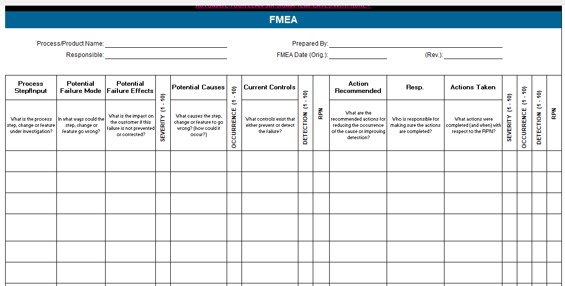
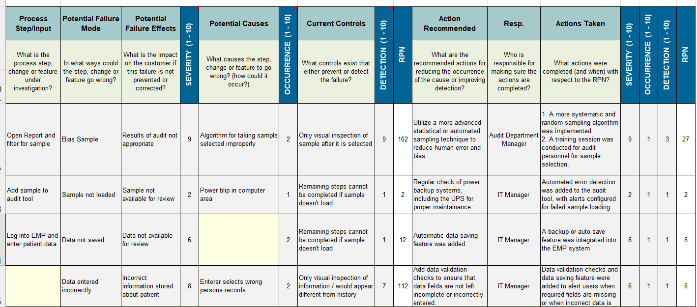
One important metric in TPM is Overall Equipment Effectiveness (OEE), calculated using the following formula:

OEE = Availability x Performance x Quality   Availability =      Actual Operating Time / Planned Production Time   Planned Production Time = Office Operating Hours – Planned Shut Down Time   Where: • Planned Shut Down are periods when not scheduled (required) to use (e.g. weekends, off-shifts, breaks, lunch, etc). Note: If you’re scheduled to run during breaks and lunches, this is not considered Planned Shutdown Time.   Quality = Good Output / Total Output   Where:   Total Output: The entire volume of equipment produced, procured, maintained, or serviced, regardless of condition or compliance. It includes all units acquired or handled during operations whether fully operational, defective, requiring repair, set aside for testing, or decommissioned during upgrades or asset transitions.Good Output: The equipment units that are fully functional, compliant with specifications, and immediately ready for official use without needing repair, adjustment, or rework. These units meet all quality, safety, and performance standards set by the agency or regulatory authorities.    

Application in the Public Sector

In the Philippine government, TPM practices are not explicitly specified. However, operational frameworks often include reliability-centered maintenance, continuous improvement programs, and cross-functional team involvement, all of which are fundamental components of TPM. Several government positions and agencies carry out activities aligned with TPM principles. Its application in the public sector involves systematic maintenance routines, efforts to boost efficiency, and strategies to reduce operational disruptions particularly within agencies responsible for managing public assets. For example, public transportation systems such as the Metro Manila Light Rail Transit (LRT) system can implement TPM to ensure their equipment, infrastructure, and trains are well-maintained, leading to fewer breakdowns and delays. By adopting TPM principles, public organizations can improve service delivery and resource management.
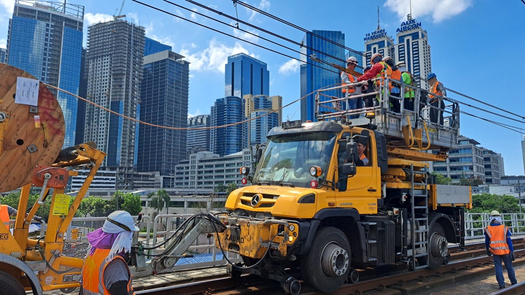
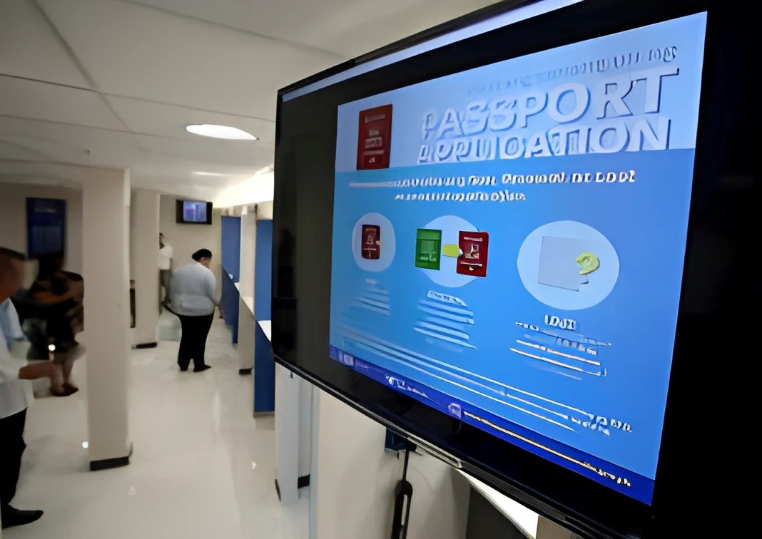
How to Do the Technique

Steps

1. Establish a TPM Team. Form a cross-functional team with representatives from operations, maintenance, and management to lead the TPM initiative.
Example: Include IT specialists, maintenance technicians, and supervisors in the team.
2. Train Employees. Provide training on TPM principles and the importance of maintenance responsibilities.
Example: Conduct workshops on basic maintenance tasks for maintenance technicians and staff.
3. Define Maintenance Tasks. Identify and document routine maintenance tasks for maintenance technicians to perform.
Example: Create checklists for daily inspections of equipment.
4. Implement Preventive Maintenance Schedule. Develop and adhere to a preventive maintenance schedule to reduce unplanned downtime. Example: Schedule regular inspection and cleaning tasks based on equipment usage.
5.Monitor and Measure Performance. Use OEE to track improvements in equipment performance and employee involvement.
Example: Calculate OEE monthly to assess the effectiveness of the TPM program.
6. Encourage Continuous Improvement. Allow employees to suggest improvements and take ownership of their equipment.
Example: Hold regular meetings to discuss maintenance challenges and successes.
7. Review and Adjust the Program. Periodically review the TPM program and make necessary adjustments based on feedback and performance data. Example: Use performance metrics to identify areas for further training or resources.

References:

  1. Agustiady, T.K. & Cudney, E.A. (2016). Total Productive Maintenance: Strategies and implementation Guide. CRC Press.
  2. Nakajima, S. (1988). Introduction to TPM. Productivity Press.
  3. Saflor, C.S.R. & Noroña, M. I. (2021). Total Productive Maintenance in the Philippine Rice Production Sector. Proceedings of the International Conference on Industrial Engineering and Operations Management Sao Paulo, Brazil. http://www.ieomsociety.org/brazil2020/papers/604.pdf


Purpose: Waste Reduction, Streamlining, Continuous Improvement

About the Tool

The Visual Factory concept comes from early Lean Manufacturing practices of the Toyota Production System (TPS). Toyota utilized visual signals to streamline operations, focusing on waste reduction and enhancing workflow. While they weren’t the only Lean practitioners to employ visual tools, they have been (and continue to be) the most notable and influential figures in Lean Manufacturing over the past century. Toyota took basic visual tools to a higher level by not only clarifying their purpose but also outlining when and how to use them for optimal impact. 

The phrase “visual factory techniques” refers to a concept in lean manufacturing that relies on visual information present throughout a workplace. It utilizes a variety of communication tools to share information precisely when and where it is needed. By using visual controls, it becomes possible to convey messages without the need for verbal communication and to disseminate information seamlessly. These visual tools are also beneficial for enhancing productivity, as employees access the information they require exactly at the right moment and location. 

Application in the Public Sector

Even though the manufacturing sector is where the Visual Factory principles originated, they have recently been successfully adapted within the public sector to improve service delivery and operational transparency. For example, government offices implemented visual management boards for tracking the status of public service requests, with both employees and citizens being able to follow the progress in real-time. In the case of hospitals, visual cues are employed to manage patient flow, hygiene protocols, and equipment availability for improved patient care and safety. These applications highlight the versatility of visual management to foster efficiency and accountability within public service. 


Sample DOH Visual Guide regarding COVID Protocols 

Sample DFA office using Visual Instructions in Passport Application

Key Benefits

  • Enhanced Communication: Visual aids cut over language barriers and simplify the representation of complex information, thus guaranteeing that all employees across the board have a clear understanding of processes and expectations.
  • Increased Efficiency. Visual management mitigates downtime by providing instant access to essential information while expediting decision-making.
  • Improved Safety. Safety protocols and danger signs are detected easily, thereby preventing accidents at the workplace, as well as ensuring compliance with safety regulations.
  • Employee Engagement. Resourcefulness remains key in order to think beyond the traditional ways of doing things.
  • Transparency and Accountability. Having publicly available performance metrics and project statuses shows transparency where progress can be known, and responsibilities are transparent.

How to Use the Tool

Here are some of the fundamental steps in implementing Visual Factory:

  1. Identify Areas and Needs. Start with an assessment of areas that would benefit in your operations from visual management. Identify those processes where missing information or miscommunication happens more often than not.
  2. Standardize Visual Tools. Create a unified set of visual aids such as signs, labels, color codes, etc., that comply with your organization’s standards, and which are easily interpreted by all the employees.
  3. Integrate Visuals into Workspaces. Visual tools should be installed strategically in the workplace so that they will be visible and accessible for this purpose-the process flowchart placed at the workstation, floor markings to define work areas, and digital dashboards to view real-time performance metrics.
  4. Educate and Train Employees. Conduct training sessions with employees for better understanding of the visual management system as well as to know the significance and interpretation of each visual element.
  5. Continuous Improvement. This entails constant review and modification of visual tools in line with feedback and constantly evolving operational requirements for the continued effectiveness of such tools

References:

Purpose: Risk Management 

Target Participants or Users:  Project Managers, Auditors, Safety Officers, Planning and Control Officers, Procurement Officers, Risk Management Officers 

About the Tool: 

Failure Modes and Effects Analysis (FMEA) is a reliability tool originally developed for manufacturing to identify and minimize potential failures before they occur. It is a structured method that pinpoints potential failure modes, their causes and consequences, and guiding actions to either prevent or correct them. Its use has now expanded into the service sector. Previous research, however, has been mainly conceptual, lacking practical guidelines tailored specifically for services.  

When applied to government services, FMEA can significantly improve efficiency, reliability, and citizen satisfaction by proactively addressing risks and vulnerabilities. FMEA can also help identify and address failures in government services like public healthcare, tax administration, emergency response, and licensing and permits by automating processes, analyzing potential failures, and creating contingency plans to improve citizen satisfaction. 

How to Use the Tool:

Steps

1. Select a service process to analyze and understand all components and their functions. Choose a process that is known to be problematic in your facility or one that is known to be problematic in many facilities. 

2. Select a cross-functional team from the affected work groups that can help complete the FMEA.  

3. Outline the process. Clearly specify the steps involved so that every team member understands what is being analyzed

4. Gain consensus on the ranking criteria for severity, occurrence and detection. The table below shows the commonly used rating guidelines. 

Severity Severity Ranking Probability of Failure Ranking Detection Detection Ranking 
Hazardous without warning 10 Very high; Failure is almost inevitable (>1 in 2) 10 Absolute uncertainty 10 
Hazardous with warning 1 in 3 Very remote 
Very high High; Repeated failures (1 in 8) Remote 
High 1 in 20 Very low 
Moderate Moderate: Occasional failures (1 in 80) Low 
Low 1 in 400 Moderate 
Very low 1 in 2,000 Moderately high 
Minor Low; relatively few failures (1 in 15,000) High 
Very minor 1 in 150,000 Very high 
None Remote: Failure is unlikely (<1 in 1.5 million) Almost certain 

Figure 1. FMEA: Ranking of Potential Failures. 

5. Draw the process flowcharts and describe the functions of each component. 

6. Identify necessary inputs to the process, such as materials, method, technology, and people actions. Anticipate and list all potential failure modes for each input at various steps in the process. You can identify the root causes of each failure mode using a cause-and-effect diagram. 

Occurrence (1–10): On a scale of 1-10, with 10 being the most likely, what is the likelihood the failure mode will occur? 

7. Evaluate the severity of the effect of the potential failure mode.  

Severity (1-10): On a scale of 1-10, with 10 being the most likely, what is the likelihood that the failure mode, if it does occur, will cause severe harm? 


8. Identify the current controls and rate the detection. List the current controls in place to mitigate or prevent failure (e.g. Training programs, Visual inspection).

Detection (1-10): On a scale of 1-10, with 10 being the most likely NOT to be detected, what is the likelihood the failure will NOT be detected if it does occur? 

9. Calculate the Risk Priority Number (RPN) to prioritize which failures require immediate attention. RPN is calculated by multiplying the Severity, Occurrence and Detection rankings for each potential failure / effect, cause and control combination. The lowest possible score will be 1 and the highest 1,000. To calculate the RPN for the entire process, simply add up all of the individual RPNs for each failure mode.

RPN = Severity x Occurrence x Detection

10. Identify the failure modes with the top 10 highest RPNs. Failure modes with high RPNs should be prioritized for attention, as they are likely to have the most significant impact on the process. On the other hand, failure modes with low RPNs are unlikely to substantially affect the process, even if eliminated, so they should be given lower priority.

11. Plan actions that mitigate the risks associated with failure modes: 

a) If a failure mode is likely to occur: 

  • Analyze the causes and determine if any or all of them can be eliminated. 
  • Consider implementing a forcing function, such as a physical constraint that prevents errors. 
  • Introduce verification steps, like independent double-checks, bar coding on medications, or alert screens. 
  • Modify related processes that contribute to the causes. 

b) If the failure is unlikely to be detected: 

  • Identify prior events that could serve as “flags” indicating the potential for the failure mode. 
  • Add a step to the process that intervenes at the earlier event to prevent the failure mode. 
  • Implement technological alerts, such as devices with alarms that notify users when values are approaching unsafe limits. 

c) If the failure is likely to cause severe harm: 

  • Identify early warning signs that a failure mode has occurred and train staff to recognize them for early intervention. For example, conduct drills to simulate events that could lead to failure, helping staff improve their ability to spot early warning signs. 
  • Provide relevant information and resources. 

12. Designate a responsible person to implement the recommended actions. 

13. Document the actions completed and reassess the RPN. Measure the success of process changes. Like all improvement projects, the success of improvement actions is evaluated. 

Sample Failure Mode and Effect Analysis (FMEA) Template and Actual FMEA 

Sample Failure Mode and Effect Analysis (FMEA) Template 


Source: https://goleansixsigma.com

Sample Actual FMEA 


Source: https://goleansixsigma.com 

References:

  1. Department of Budget and Management (2012). Philippine Government Internal Audit Manual. https://www.dbm.gov.ph/wp-content/uploads/2012/03/PGIAM.pdf 
  2. IHI (n.d.). Patient Safety Essentials Toolkit: Failure Modes and Effects Analysis (FMEA). https://www.ihi.org/sites/default/files/SafetyToolkit_FailureModesandEffectsAnalysis.pdf 
  3. GLSS (2025). Template: Failure Modes & Effects Analysis (FMEA). GoLeanSixSigma.com https://goleansixsigma.com/failure-modes-effects-analysis-fmea 
  4. CMS (n.d.). Guidance for Performing Failure Mode and Effects Analysis with Performance Improvement Projects. https://www.cms.gov/medicare/provider-enrollment-and-certification/qapi/downloads/guidanceforfmea.pdf 
  5. Gupta, P. (2005). The Six Sigma Performance Handbook. The McGraw-Hill Companies Inc. USA. 

About the Tool

An idea sheet is an idea proposal consultation template used to organize ideas when designing a citizen-centered public service. It helps teams to document the results of ideation processes and transform them into actionable solutions. The key components include a problem statement, objectives, target audience, key features, implementation plan, and evaluation metrics. Public service designers can use an idea sheet to ensure that their solutions are well-thought-out, feasible, and aligned with the needs and expectations of the citizens they serve.

Purpose: Synthesizing of ideas

Estimated Time Needed: 30 minutes

Target Participants or Users: Change Managers, Community Engagement Teams, Operations Managers, Public Service Providers, Process Planners, Policymakers, Service Designers

How to Use the Tool

Steps:

  1. Select your innovation project.
  2. Select a stakeholder/s for your solution.
  3. Fill out the description using the following guide questions:
  • a. What are the objectives of the idea?
  • b. What are the immediate gains and long-term results for your target beneficiaries?
  • c. What are the basic features of the idea?
  • d. What is the most important thing to look for?
  • e. How different is it from the existing one?
  • f. How will this idea be executed?
  • g. How does this idea align with the needs or requirements of your target users?

Sample Idea Sheet Template

Sample Idea Sheet Activity Output

About the Tool

An affinity diagram organizes and categorizes large volumes of data, ideas, or insights by grouping them based on natural relationships. Typically, participants write down ideas on sticky notes and then work together to sort these notes into clusters that represent common themes or concepts. This method is especially useful for organizing ideas generated during brainstorming or ideation sessions, helping to identify patterns and structure in complex information.

Purpose: Synthesizing of ideas

Estimated Time Needed: 15 minutes

Target Participants or Users: Change Managers, Program Managers, Operations Managers, Planning Officers, Process Planners, Service Designers

How to Use the Tool

Steps:

  1. After brainstorming and ideation sessions, each team should group similar ideas. As each person adds notes on the board, one team member will group ideas into themes. Make sure the board also has a “Miscellaneous” section for notes that do not seem to fit with other themes. Use lines to connect related groups and combine clusters to create super groups if necessary.
  2. Ask each group to place a creative title on top of each category to summarize its contents.
  3. Team members are also encouraged to build on each new idea added to the board.
  4. Share and discuss clustered ideas as a group.

Sample Affinity Diagram Template

Sample Affinity Diagram Activity Output

Dam, R. F. and Teo, Y. S. (2022, May 2). Affinity Diagrams: How to Cluster Your Ideas and Reveal Insights. Interaction Design Foundation – IxDF. https://www.interaction-design.org/literature/article/affinity-diagrams-learn-how-to-cluster-and-bundle-ideas-and-facts

About the Tool

A design charrette is a short, collaborative meeting during which team members quickly collaborate and sketch designs to explore and share diverse ideas.

The goals and benefits of design charrettes include drawing inspiration from diverse ideas, providing a creative jump-start for designers, gaining insight into priorities across various functional groups (while building consensus), and ensuring that all participants feel equally heard and valued.

Purpose: Ideation

Estimated Time Needed: 30 minutes

Target Participants or Users: Change Managers, Program Managers, Operations Managers, Planning Officers, Process Planners, Policymakers, Service Designers

How to Use the Tool

Steps:

  1. Using a pen and paper, each team member sketches their own ideas for 15 minutes, answering the challenge statement “How might we?” This is supposed to be fast. People may sketch one or several ideas until they run out of paper, ink, or inspiration.
  2. Each team member will be given 3 minutes to share their idea, which will be critiqued by team members.
  3. After the 1st round, the team members will work in pairs for 15 minutes to synthesize the good concepts and come up with the next better design concept.
  4. The pair will be given 3 minutes to share their idea, which will be critiqued by team members.
  5. Together, as a group, critique these new designs and make final decisions about the solutions you’d like to carry into prototypes.

Sample Activity

Sample Design Charrettes

  1. DOEE (2018). Integrated Design Charrette Toolkit. https://doee.dc.gov/sites/default/files/dc/sites/ddoe/service_content/attachments/DC-NZECharetteToolkit.pdf
  2. Project Re-Envision (2019). Design Charrette Report. https://pre.dcp.ufl.edu/wp-content/uploads/2021/04/04122020-HUD-Re-envision_8x11.pdf

About the Tool

Purpose: Productivity Measurement

A histogram is a type of graphical data representation where the frequency of various values within a dataset is shown using rectangular bars. Though it primarily concentrates on displaying the distribution and frequency of data points, it resembles a bar graph. The height of each bar shows the frequency with which a given value or event occurs in the dataset.  It makes it easier to understand and analyze the distribution and the general pattern of data, and identify areas that need improvement.

The histogram serves as a versatile graphical tool for overall efficiency and quality. Among the many applications for histograms are done in quality planning, where they help identify concerns and root causes of problems, enabling better decision-making. In quality control, they help identify issues and implement corrective steps. In project management, they help identify difficulties and repeating trends and thus prioritize measures to enhance quality, particularly for agile techniques.

How to Use the Tool

Estimated Time Needed: 30 minutes

Target Participants or Users: Process Owners, Planning Officers, Quality Control Assessors/Evaluators, Project Managers

Steps

  1. Gather all the needed data.
  2. In the first column, categorize the gathered data and list the datasets in ascending order.
  3. In the second column, create intervals of equal length.
  4. In the third column, include the frequency of data points under each interval.
  5. Based on the given data, draw and label the horizontal (x) and vertical (y) axes.
  6. Draw bars according to the frequency and interval of the given data. Bars must not have spaces between them.
  7. Provide a title for the histogram chart.

Sample Histogram


About the Tool

Purpose: Productivity Measurements

A flowchart is a graphical representation of a process that outlines the necessary steps and decisions to achieve a specific outcome. Each step in the process is represented by a diagram shape, connected by lines and arrows that guide the viewer through the sequence. This visual representation enables anyone to understand and follow the process from start to finish quickly. A flowchart is a valuable business tool that, when designed and constructed effectively, can convey the steps involved in a process clearly and concisely, streamlining communication and increasing efficiency.

Flowcharts are essential in various industries, such as production, day-to-day operations, sales, and software development. They help streamline processes, improve communication, and identify defects. In production, they illustrate product development, manufacturing, quality assurance, and maintenance, while in day-to-day operations, they automate workflows and improve productivity. In sales and marketing, they visually represent project approaches, strategies, and communication plans. Moreover, flowcharts aid developers in visualizing complex information and making informed decisions.

How to Use the Tool

Estimated Time Needed: 1.5 hrs

Target Participants or Users: Process Owners, Planning Officers, Quality Control Assessors/Evaluators, Project Managers

Steps

  1. Define the start, end, and process or system to be represented in the flowchart.
  2. Familiarize yourself with the different symbols used to make a flowchart, such as the start, end, process, decision, loops, and connectors.
  3. Determine the flow direction if it is top-down or left-right direction.
  4. Organize the steps or information in the correct order. Begin with the start symbol and connect with the process flow.
  5. Add connectors such as lines and arrows to show the direction or flow of the steps or information. Include loops if a process flows back to the previous steps to demonstrate repetition or cycle.
  6. Review the flowchart for flaws or errors and revise based on the feedback.

Sample Flow Chart

About the Tool

Purpose: Productivity Measurement

A Pareto Diagram is a graphic tool that shows the primary factors contributing to problems. Originating from the Pareto Principle, or the 80/20 rule, established by economist and engineer Vilfredo Pareto, it suggests that 80% of the results are derived from 20% of causes. The diagram has two types of data composed of a curved line that represents the data’s cumulative total and bars that show individual values arranged in descending order. There is also an 80% cut-off line to show where the 80/20 rule applies. The few important issues that demand the greatest attention fall under the 80% cut-off line.

Pareto diagrams are a useful tool for root cause and problem analysis in a variety of contexts, including business revenues, traffic, transportation, and manufacturing processes. They break down problems into components and communicate the significant causes of issues that may be impacting efficiency and outputs within departments or sectors. Manufacturers also use it to analyze quality and defect because they show the frequency and severity of certain problems. It helps managers prioritize solving the most important problems first.

How to Use the Tool

A. Organizing the data
1. Identify and list the problems or issues.
2. Organize the problems or issues into groups or categories.
3. Create three columns for categories of problems, their corresponding frequency, and cumulative percentage.

  • To calculate the cumulative percentage, divide the cumulative frequency by the total number of observations. Then multiply the result by 100.

    Cumulative percentage = (Cumulative frequency ÷ n) x 100
  • To calculate the current cumulative frequency, add all other preceding frequencies together

    Cumulative frequency = f1 + f2 +…

4. Organize data based on the frequency in descending order.

B.  Creating the Pareto diagram
1. Construct a chart with the left vertical (y) axis scaled from 0 to at least the grand total 
2. Put the appropriate label on the y-axis.
3. Scale the right vertical axis from 0 to 100 percent, with the 100 percent on the right side with the same height as the grand total on the left side.
4. Label the horizontal axis (x) with the category names in descending order.
5. Draw bars representing the amount of each category. The height of the bars is determined by the left vertical (y) axis.
6. Draw a line that shows the cumulative percentage based on the Pareto data table. The cumulative percentage line is determined by the right vertical (y) axis.

References:

  1. Marson, B. (Ed.) (2020). APO Manual: Public-sector Productivity. Asian Productivity Organization. https://doi.org/10.61145/LGOT4261
  2. Pyzdek, T. & Keller, P. (2013). The Handbook for Quality Management. (3rd Edition). McGraw-Hill, USA.

About the Tool

Purpose: Productivity Measurement

It records data in a systematically organized manner by tracking the frequency of specific events, defects, or other information. Check sheets are used to see how a process works and to count mistakes by type, location, and cause.

Examples of check sheets:

  1. A Tally Sheet is frequently used to gather information on quality issues and calculate the frequency of occurrences.
  2. A Checklist for Process Probability Distribution is used to obtain primary frequency distribution data.
  3. The Defect Checklist categorizes process flaws based on deformity and frequency of occurrence. 
  4. The Defect Cause Sheet tracks the causes of problems in the process.
  5. A Location Sheet uses a visual representation of the problems by indicating exactly where the problem is in a certain material.
  6. Graphical Sheets help people see information and understand how data spreads out.

Using a check sheet in the workplace helps individuals complete their tasks quickly and efficiently.

How to Use the Tool

Estimated Time Needed: 1 hr

Target Participants or Users: Process Owners, Planning Officers, Quality Control Assessors/Evaluators

Steps

  1. Decide on what data needs to be recorded.
  2. List the specific information to be monitored and provide a space for comments
  3. Determine the frequency of data gathering.
  4. Create the form and label accordingly. Include title, date/time, location, name of the checker/assessor, and categories.
  5. To verify that all necessary information is provided and that the form is user-friendly, pilot test the checksheet and revise based on the given suggestions.
  6. Obtain final approval before using the form.
  7. Educate the users on how to use the form.

References:

Marson, B. (Ed.) (2020). APO Manual: Public-sector Productivity. Asian Productivity Organization https://doi.org/10.61145/LGOT4261

Six Sigma Study Guide https://sixsigmastudyguide.com/check-sheet/